For Procivis, this challenge was unique. Our technology for digital identity and credentials is mainly invisible by design. It runs in the background, enabling governments, enterprises and their citizens/users to rely on trusted digital data. How do you design a brand for a company that cannot be seen, yet aims to be recognized everywhere across borders and industries?
As we launched our new product, Procivis One, for next-generation digital identity beginning of 2024, we also reimagined the brand to clearly reflect our product focus in the market.
Swiss precision meets digital universality
Swiss companies have a tendency to lean on similar visual shorthand to reflect their origin: a red logo or the Swiss cross stamped somewhere. It is iconic, but also predictable. The Swiss cross and flags can only say so much.
We wanted to express our Swissness in a more subtle and contemporary way. For us, our identity is not about clichés but about clarity, precision and type. That is why we created a bespoke typeface. It carries the famous legacy type of Helvetica and Frutiger but makes it unmistakably Procivis. Swiss in origin, but able to speak across markets and industries.
And instead of repeating the flat Swiss cross, we reimagined it.
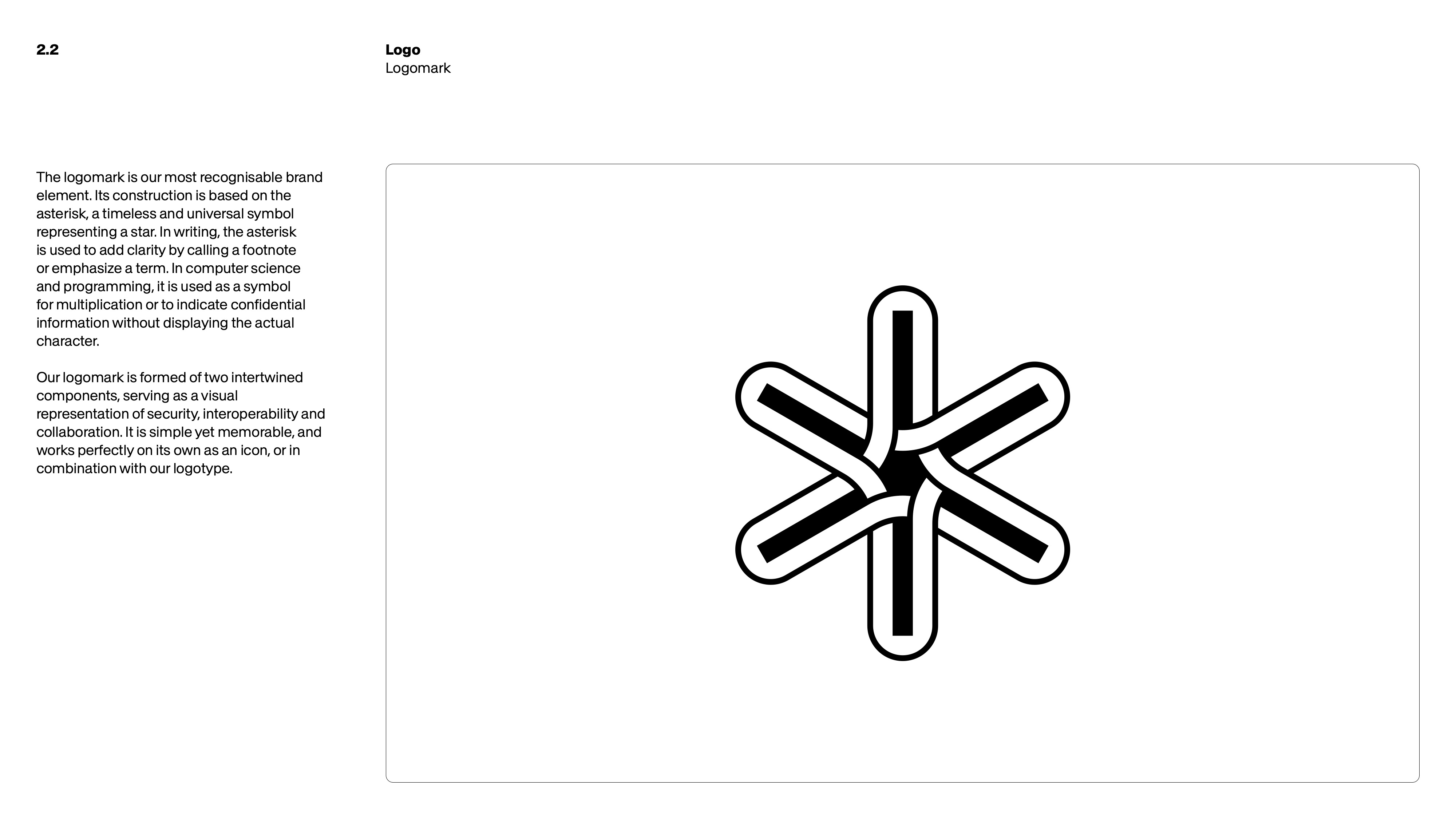
The most visible element of our new identity is our logomark. It is rooted in the asterisk - a three-dimensional cross and globally recognized form. This design subtly references our Swiss heritage but translates it into the universal language of the digital world. The asterisk clarifies meaning in writing, it multiplies and connects in programming and it securely masks passwords in everyday digital life. In short, it stands for security and trust.
Our logomark reflects our north star. The two intertwined components of the mark serve as a visual representation of security, interoperability and connection, mirroring the trust triangle: issuer, holder and verifier.
A system built for flexibility
A brand must travel across contexts. For our product Procivis One, flexibility and modularity are core principles.
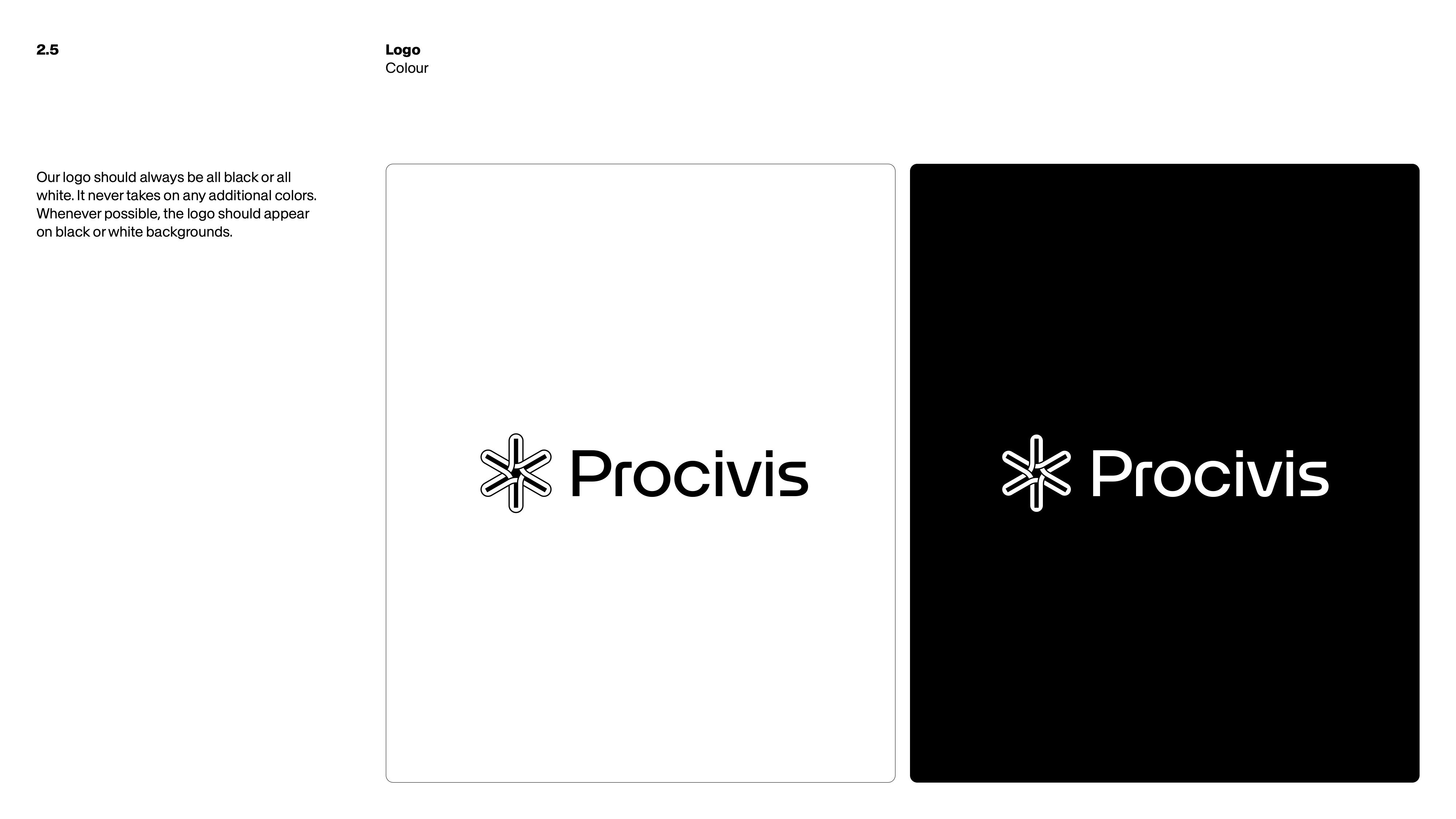
On the visual side, black and white form the foundation. Directly inspired by our technology, the Procivis color palette is all about focus, clarity, and precision. Coupled with typography, it forms a key part of our brand. Accent colors are typically applied when additional values are needed for illustration or data visualization.
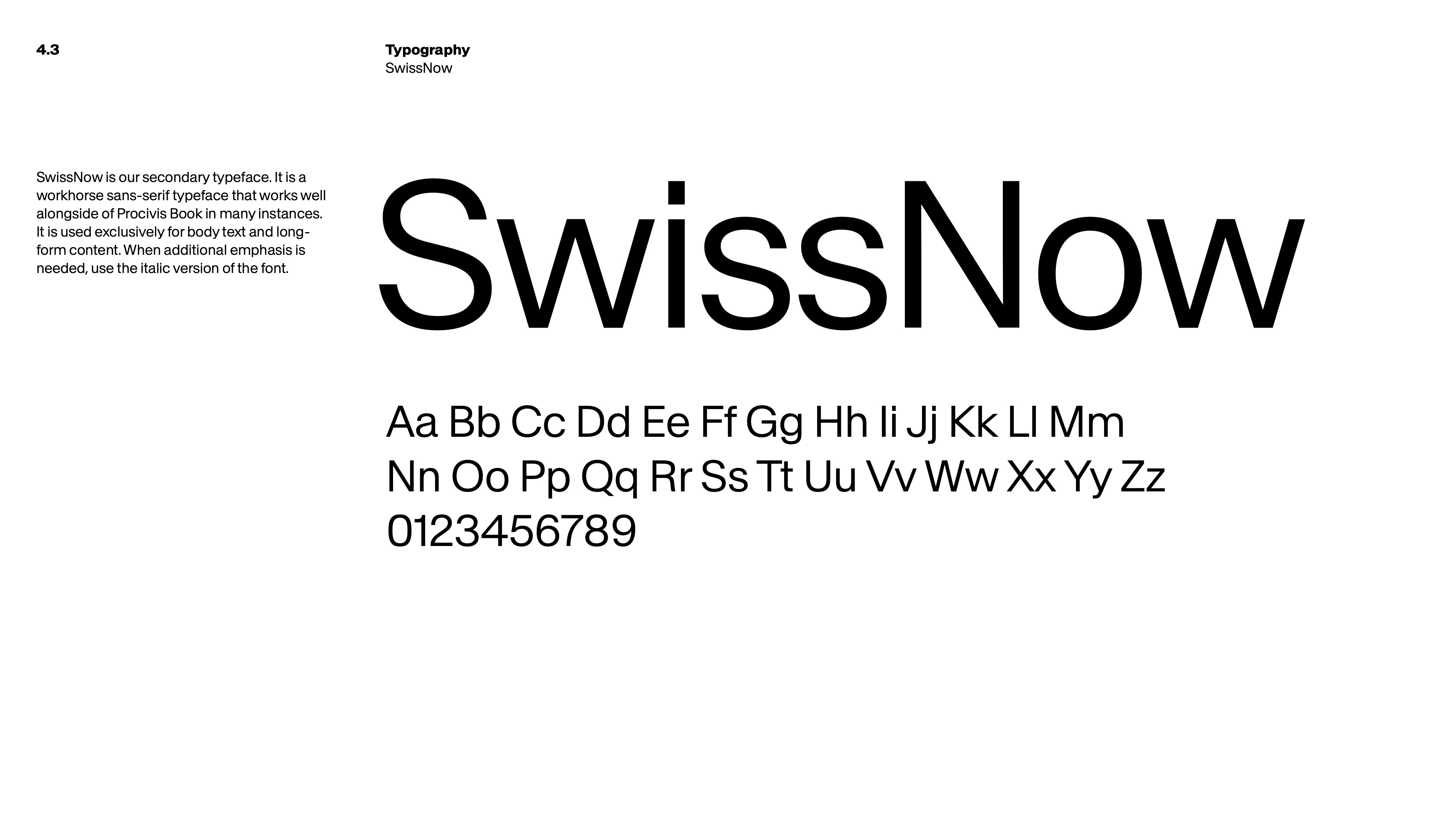
Typography follows the same idea. Procivis Book, our bespoke typeface, builds on famous typographic tradition and gives us a distinct, contemporary voice. SwissNow supports it as a functional body typeface for longer content. Together they keep the tone clear and calm, and allow the brand to speak consistently across languages, regions and channels.
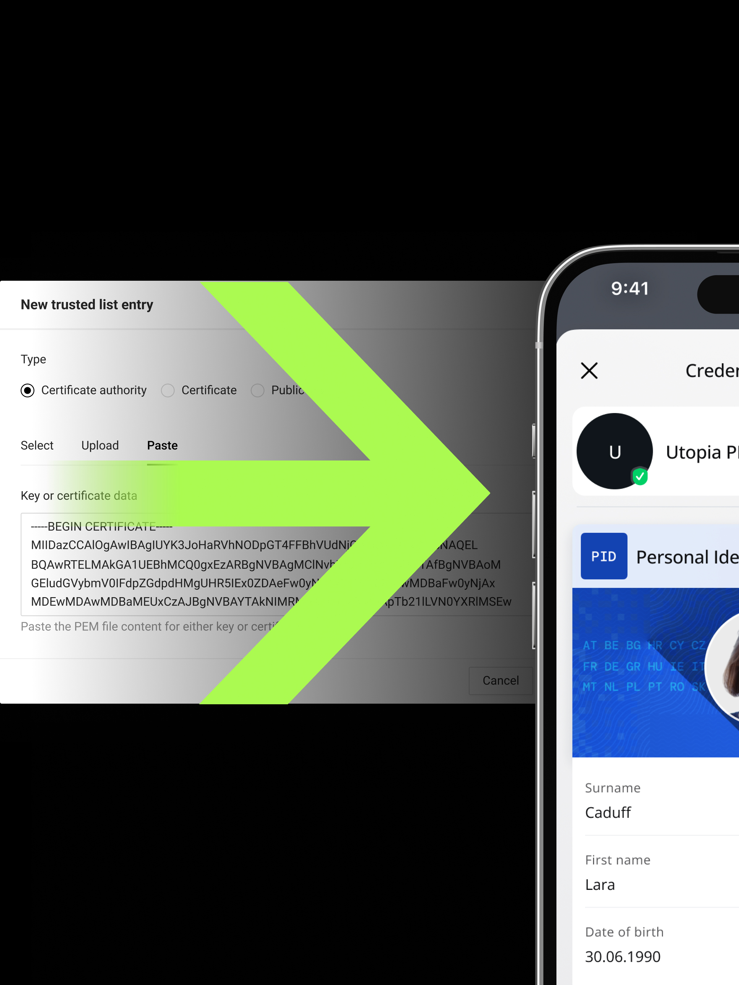
On the product side, Procivis One mirrors that flexibility. Procivis One is a modular, open-source technology for digital identities and credentials — compliant with eIDAS 2.0, Swiss E-ID ecosystem, and mDL standards.
Imagery that illustrates trust
Our technology runs in the background, so our imagery must make its impact visible.
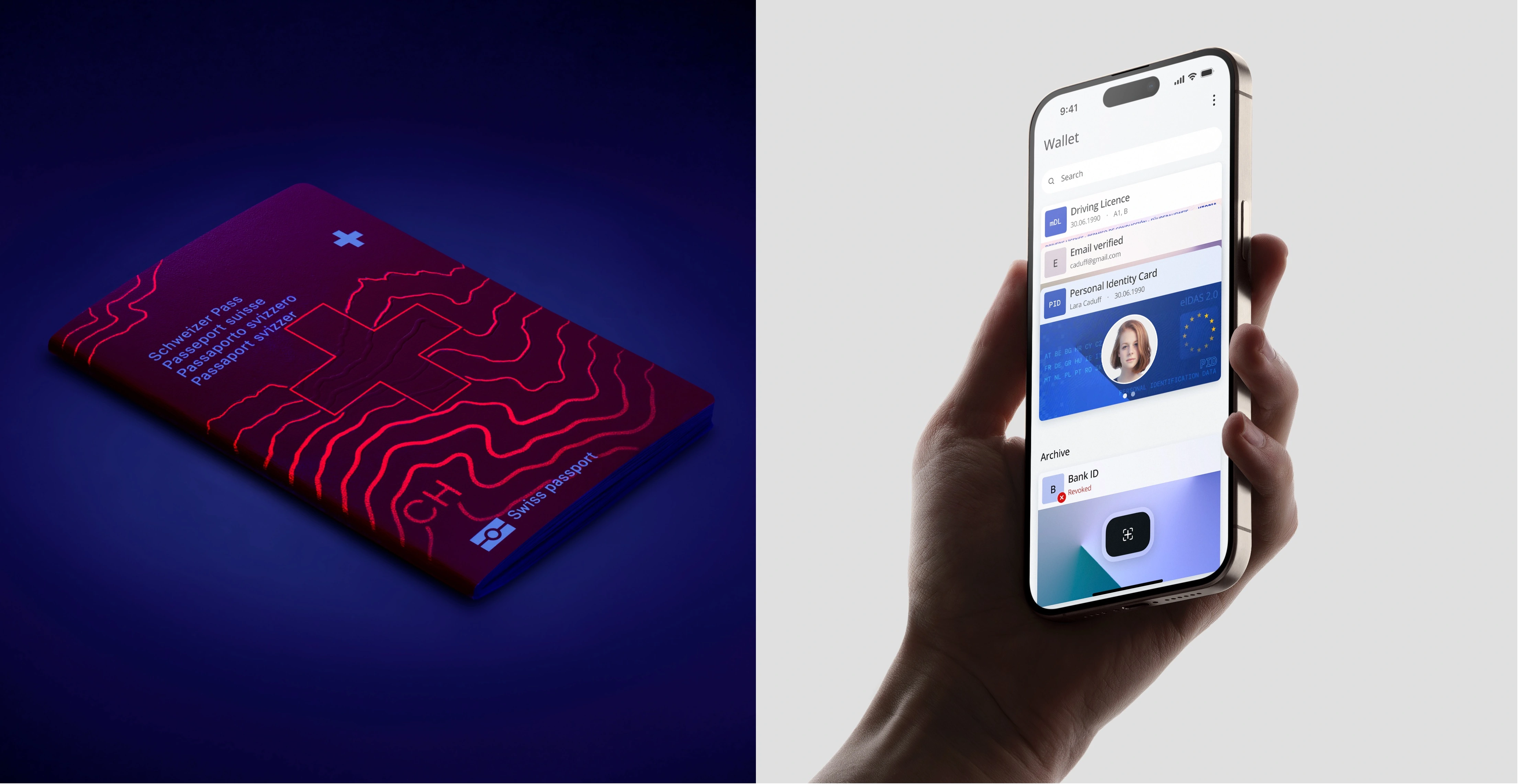
For the broader view, we use hero landscapes. They imagine societies connected by trusted digital data: issuing, holding, and verifying digital identity and credentials across borders and industries.
For the human scale, we use what we call aspirational images. These show everyday interactions where trust becomes tangible.

A voice with less noise and more know-how
A brand is not only seen. It is also heard.
Our voice reflects the same values as our design. Clear, precise, and simple. We avoid jargon, speak with confidence, and focus on what matters. Whether we are addressing institutions, solution providers or end users, we adapt without losing clarity.
Conclusion
The less visible a company is, the more carefully it has to design the signals people do see. For Procivis, the challenge was to create signals of trust that travel across boundaries and markets.
For our rebrand, we partnered with Retinaa, the design agency behind the award-winning Swiss passport, printed by our mother company Orell Füssli.
It is a natural match: the trust arc extending from physical identity to digital identity.